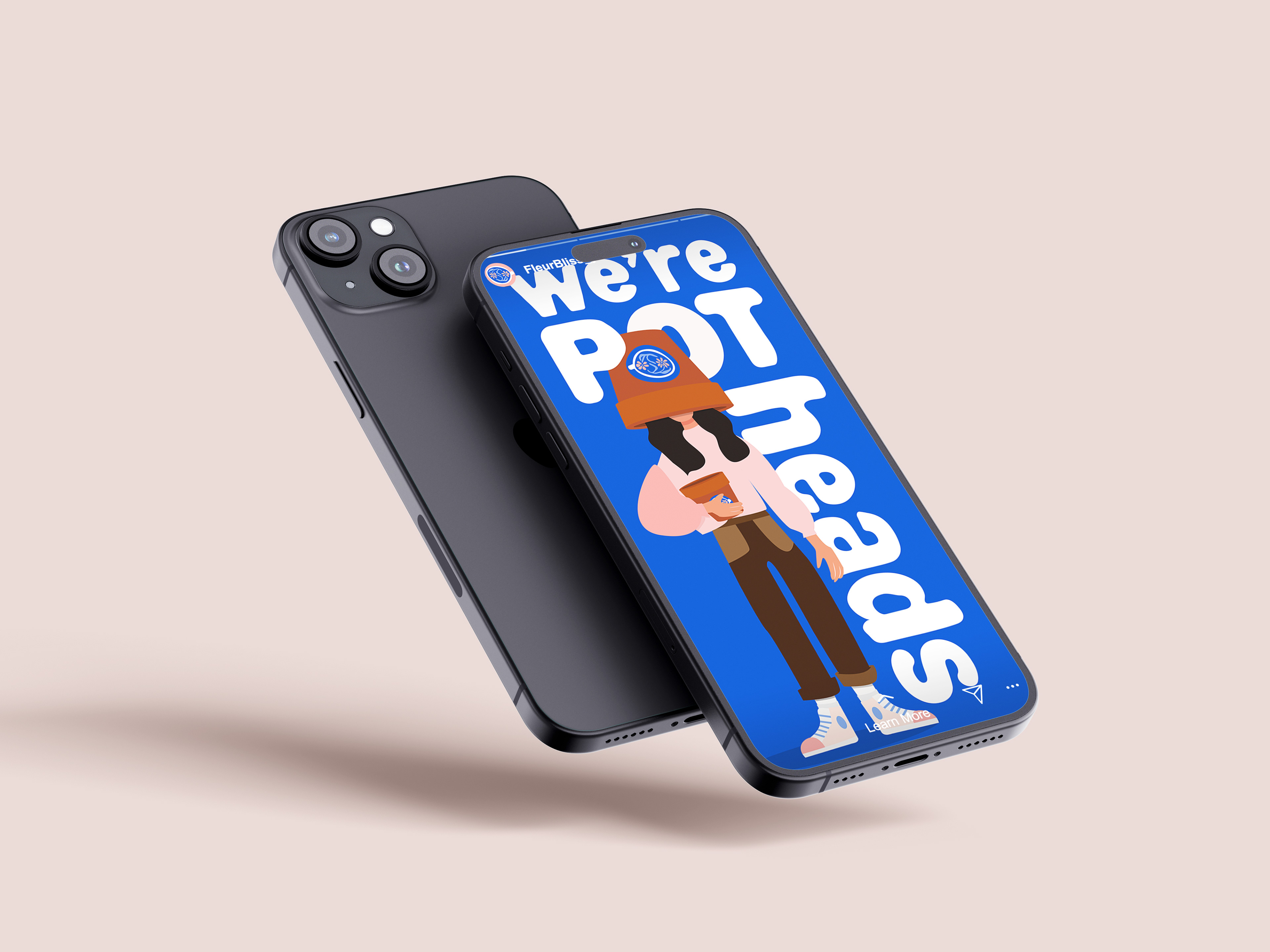
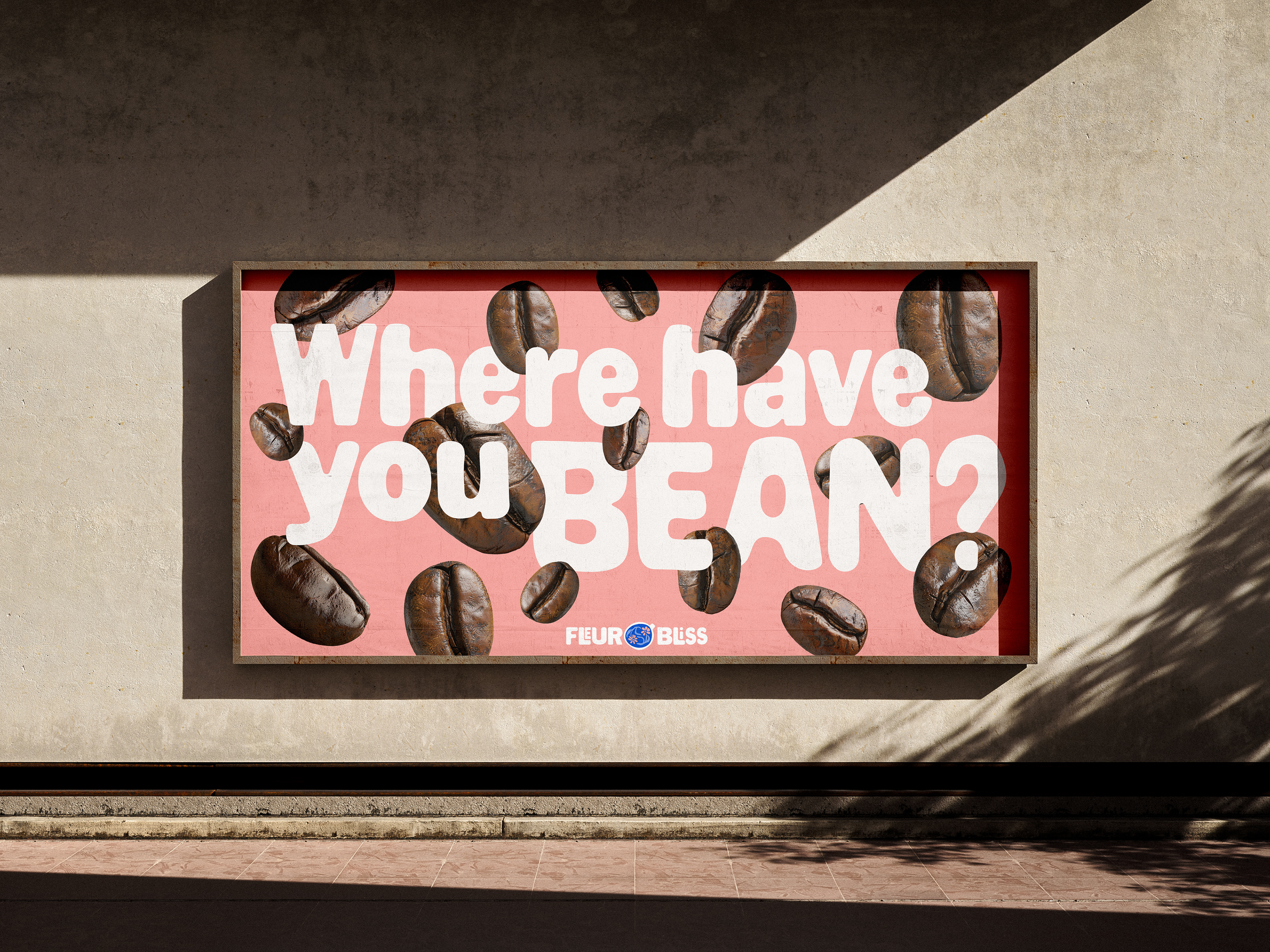
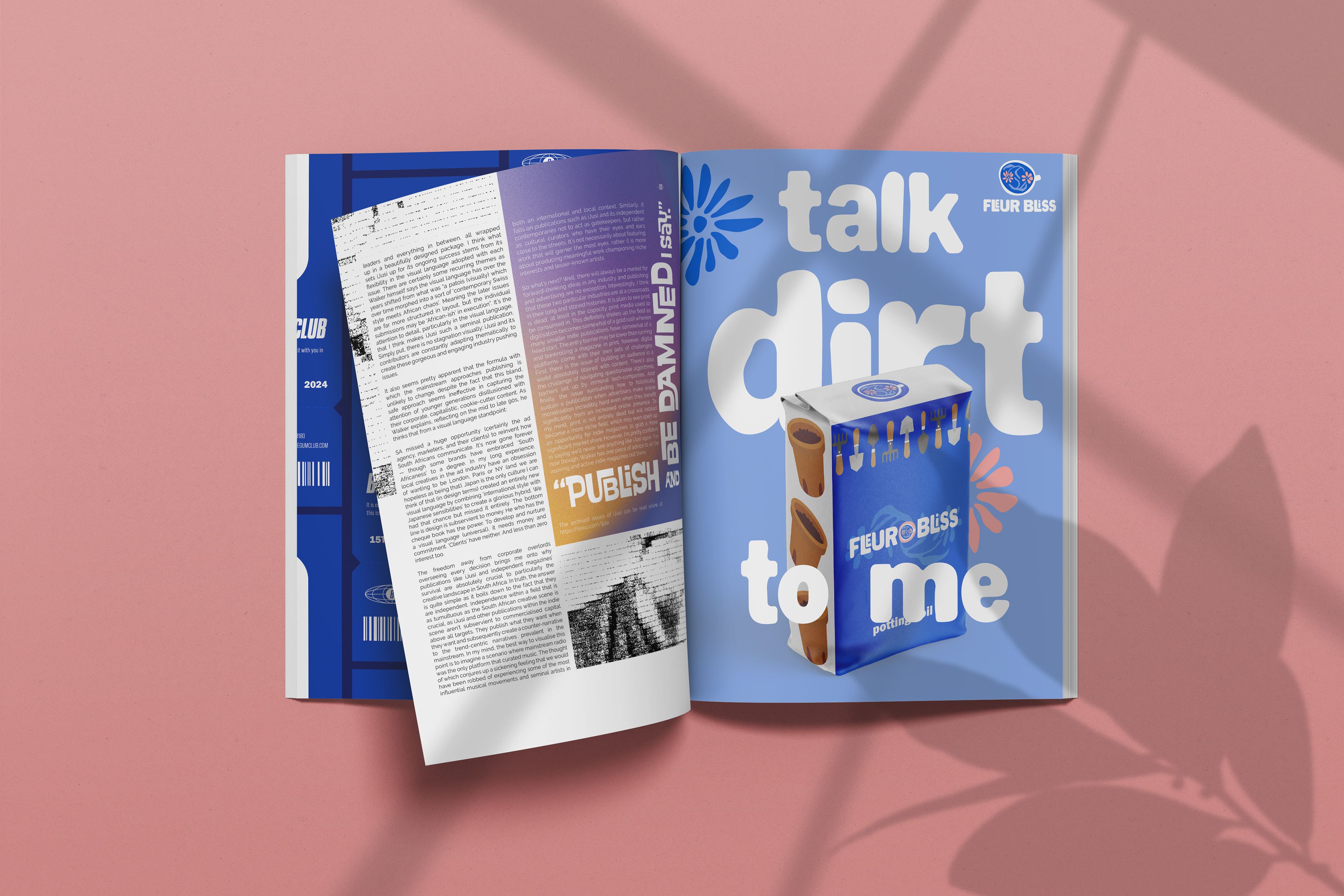
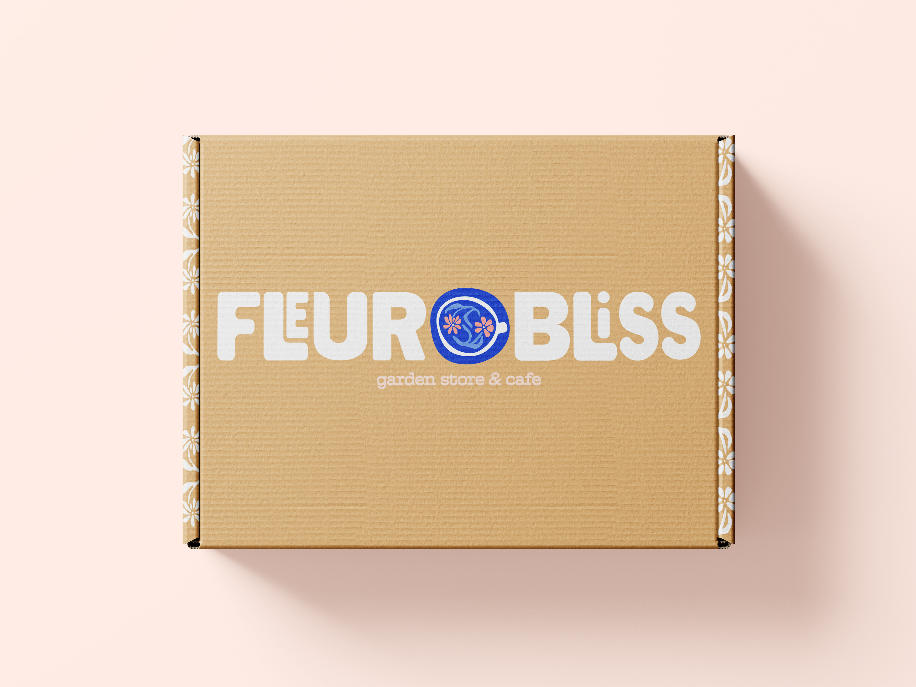
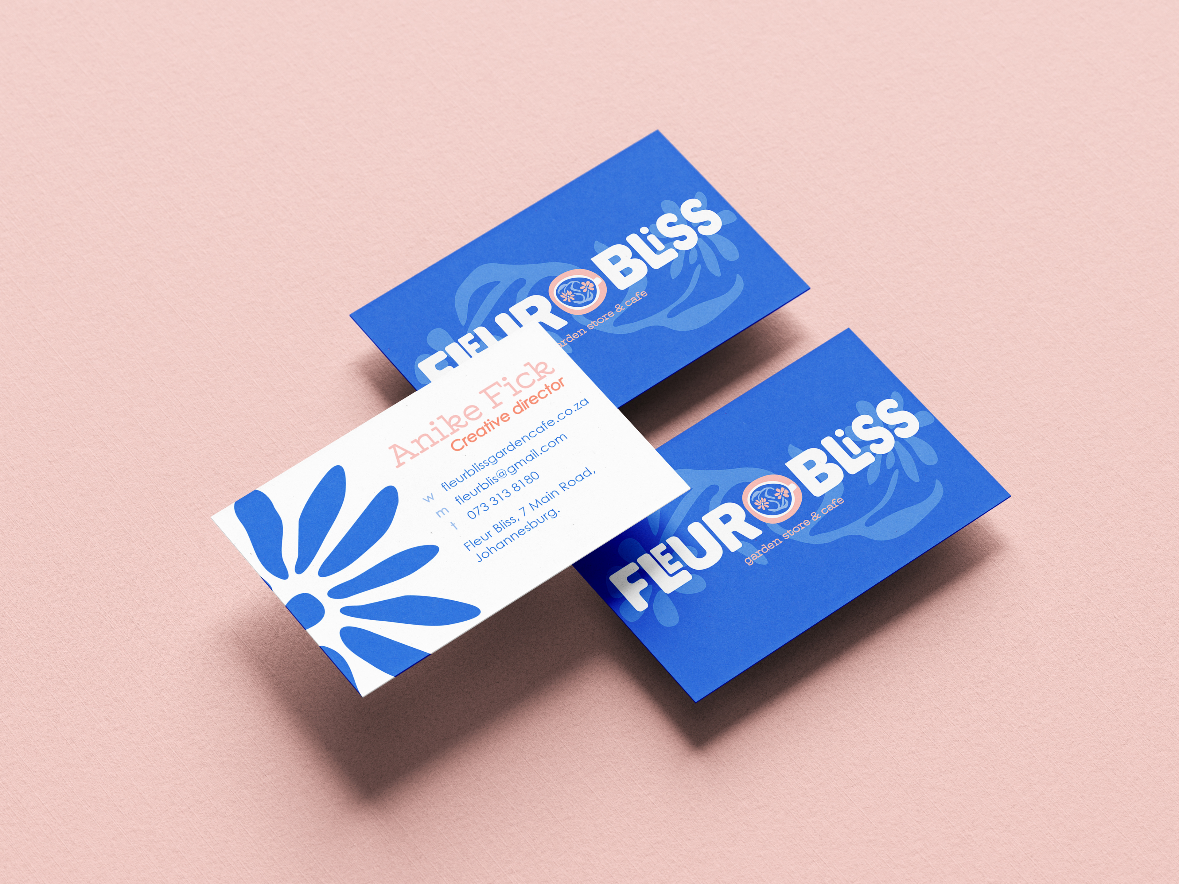
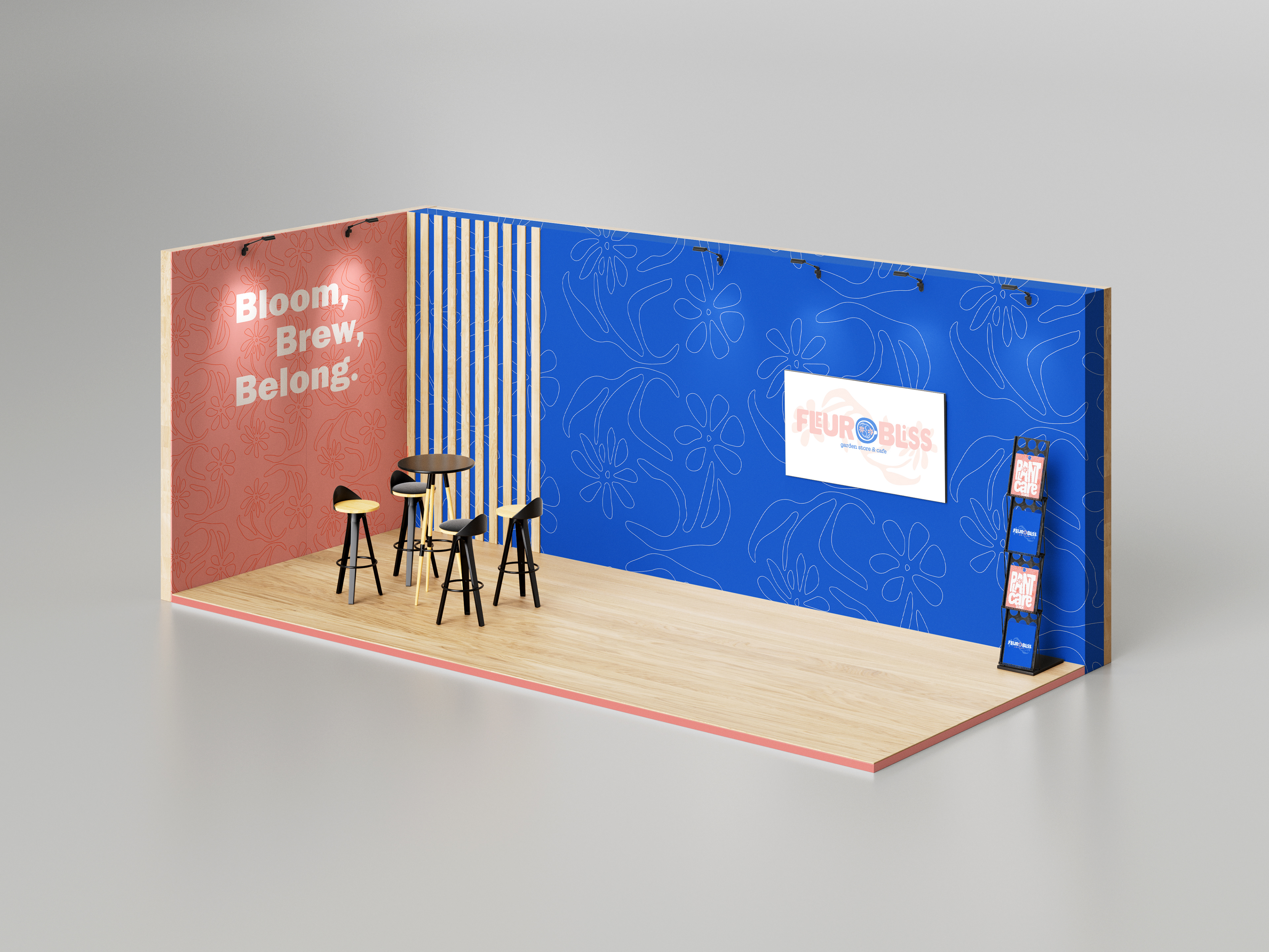
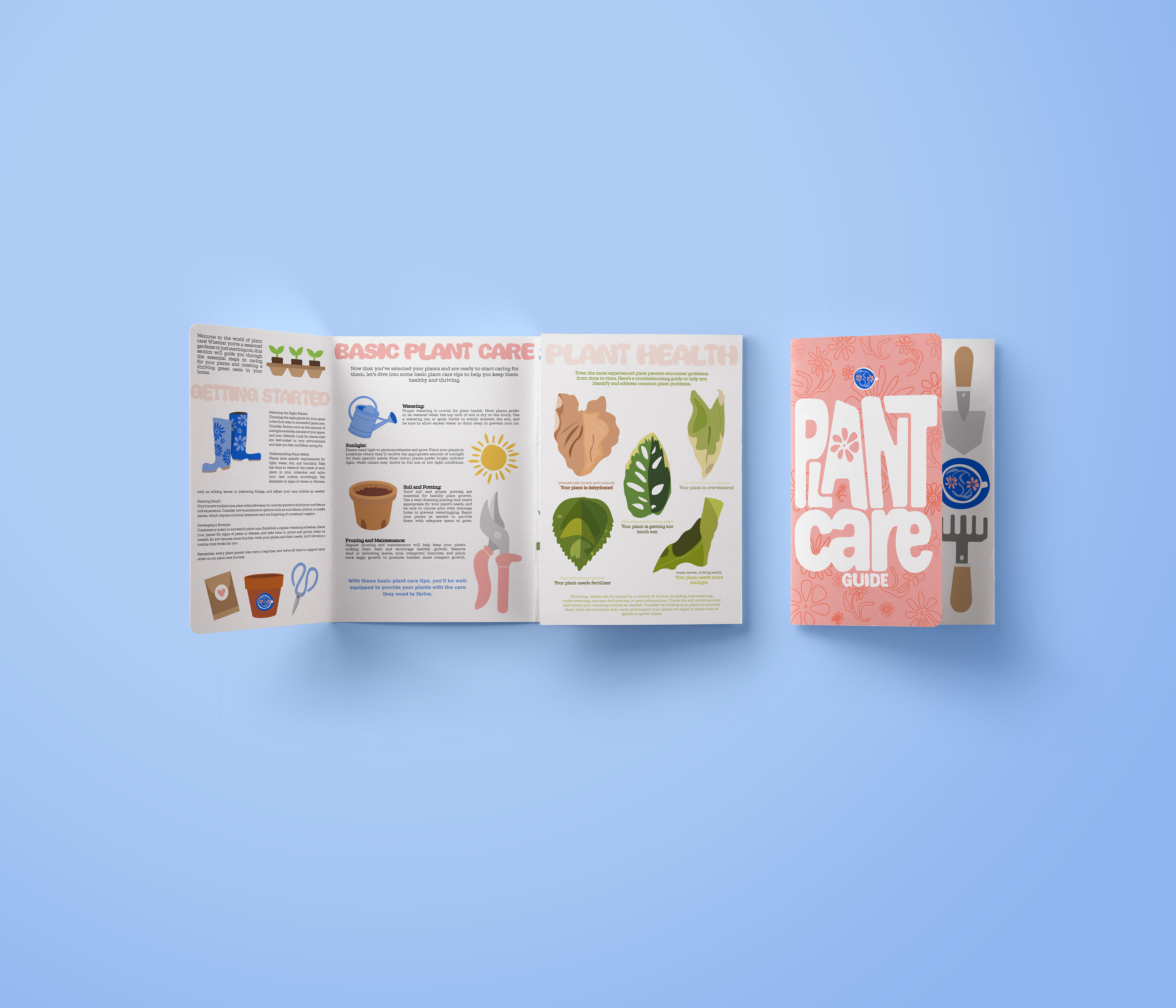
For this branding project, we were tasked to create a brand AND a marketing campaign. I decided to go in a humorous direction with wordplay. I designed the typography for this brand to make it feel more organic and natural. I enjoyed doing this project, because we had a lot of creative freedom.
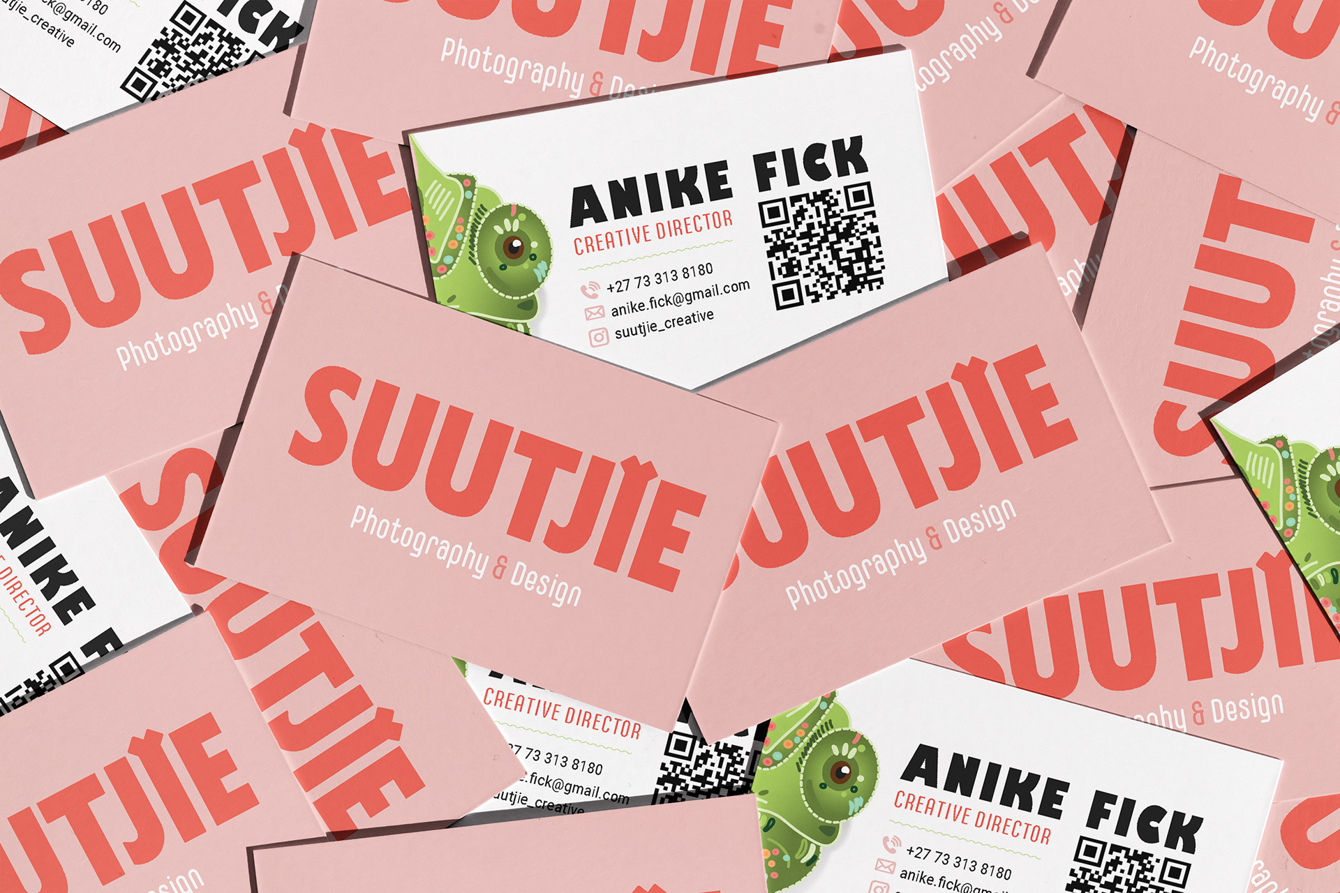
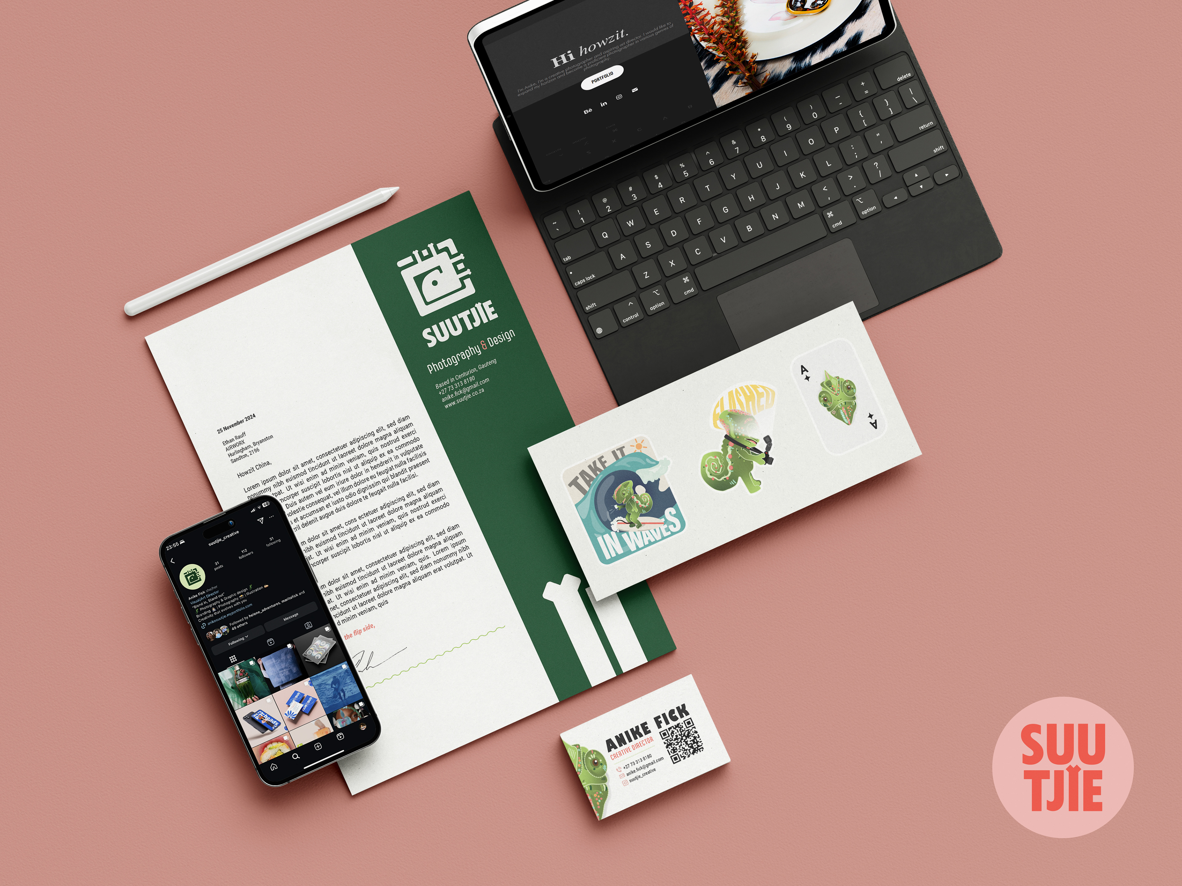
This branding project was a personal design project -- I decided to go in a direction that was bright. bold and loud. It has a touch of my Afrikaans roots and is called "Suutjie" like a trapsuutjie otherwise known as a chameleon. I saw myself as a chameleon for this project. I believe that I can adapt to my surroundings by blending in boldly.
